Colour is doing more than ever right now.
It shapes how your living room feels, how big it looks, and how comfortable it actually is to live in. In 2026, the shift is clear. Spaces are becoming warmer, softer, and more intentional.
Across Spain, Portugal, and the Netherlands, contractors and FF&E teams are moving away from cold, safe interiors and focusing on something more natural and balanced.
Earth Neutrals
The era of grey is fading.
What’s replacing it are warm neutrals like sand, clay, and soft beige. These tones create a calm base without feeling empty or flat.
They also make everything else work better. Sofas, wood finishes, and textiles stand out without competing.
If you are building a living room from scratch, this is where it should start.
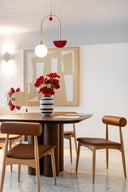
Deep Greens
Green has become a key colour in modern living rooms.
Olive, moss, and deeper forest tones help ground the space. They bring a connection to nature and make interiors feel more relaxed.
Used on a wall, in curtains, or through furniture, green adds depth without feeling heavy.
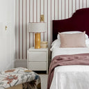
Soft Dark Tones
Darker colours are coming back in a more controlled way.
Muted navy, warm charcoal, and soft slate are being used to create atmosphere. The goal is not to make a room feel smaller, but to make it feel more intimate.
These tones work best when combined with good lighting and simple materials.
Warm Accents
Not everything needs to be a big change.
Small details in warm tones can shift the entire space. Colours like apricot, copper, and soft terracotta bring energy without overpowering the room.
This is one of the easiest ways to update a space through FF&E without redoing everything.

Tonal Layering
One of the most important ideas right now is layering the same colour.
Using lighter and darker versions of one tone creates depth without adding clutter. It keeps the space clean but still visually rich.
For contractors and FF&E planning, this approach simplifies decisions and keeps the result consistent.
Conclusion
Good design is not about following trends exactly.
It is about using them in a way that fits the space and the people living in it.
In Spain, Portugal, and the Netherlands, the direction is clear. Warmer tones, natural colours, and simple layering.
Start with a strong base, add depth carefully, and keep the space balanced.


The Modern Living Room Colour Trends 2026
Colour is doing more than ever right now.
It shapes how your living room feels, how big it looks, and how comfortable it actually is to live in. In 2026, the shift is clear. Spaces are becoming warmer, softer, and more intentional.
Across Spain, Portugal, and the Netherlands, contractors and FF&E teams are moving away from cold, safe interiors and focusing on something more natural and balanced.
Earth Neutrals
The era of grey is fading.
What’s replacing it are warm neutrals like sand, clay, and soft beige. These tones create a calm base without feeling empty or flat.
They also make everything else work better. Sofas, wood finishes, and textiles stand out without competing.
If you are building a living room from scratch, this is where it should start.
Deep Greens
Green has become a key colour in modern living rooms.
Olive, moss, and deeper forest tones help ground the space. They bring a connection to nature and make interiors feel more relaxed.
Used on a wall, in curtains, or through furniture, green adds depth without feeling heavy.
Soft Dark Tones
Darker colours are coming back in a more controlled way.
Muted navy, warm charcoal, and soft slate are being used to create atmosphere. The goal is not to make a room feel smaller, but to make it feel more intimate.
These tones work best when combined with good lighting and simple materials.
Warm Accents
Not everything needs to be a big change.
Small details in warm tones can shift the entire space. Colours like apricot, copper, and soft terracotta bring energy without overpowering the room.
This is one of the easiest ways to update a space through FF&E without redoing everything.

Tonal Layering
One of the most important ideas right now is layering the same colour.
Using lighter and darker versions of one tone creates depth without adding clutter. It keeps the space clean but still visually rich.
For contractors and FF&E planning, this approach simplifies decisions and keeps the result consistent.
Conclusion
Good design is not about following trends exactly.
It is about using them in a way that fits the space and the people living in it.
In Spain, Portugal, and the Netherlands, the direction is clear. Warmer tones, natural colours, and simple layering.
Start with a strong base, add depth carefully, and keep the space balanced.